Case Study
Through market analysis, secondary research, journey mapping, and user interviews (meet, Sam! — our primary user persona below), I worked with my team to identify the key touchpoints and “moments that matter.” From there, we explored how to turn assumptions that:
Donating should be a free service.
Donating is an opaque process.
Business as usual is depressing.
What's good for business can't be good for the community or the planet.
It's difficult to fully comprehend the collective impact.
Waste is a necessary by-product.
Into critical opportunities to:
Prioritize personal convenience as to why individuals are willing to pay for this service.
Visualize the interconnected impact that is made.
Communicate immediate value.
Emphasize a fully-transparent process.
If Sam could wave a magic wand, her wish would be “For a company to bring waste disposal into the 21st Century. To be able to give bulk, unorganized, random items and have a company that sorted and did what was appropriate. I would pay to have my guilt about the climate crisis lessened if the company promised to do their best and I could trust their practices.”
As our main user, her needs were distilled down to (1) Personal convenience, (2) Community Giving, (3) Environmental Impact which I used to inform our social media strategy and which features were prioritized.
With our limited timeline in view, I used a Feature prioritization matrix and MoSCoW map and worked closely in conjunction with our lead engineer to prioritize features were feasible and most necessary for our MVP launch.
By synthesizing user interviews and secondary research, I mapped an experience blueprint that identified principles and opportunities based on key insights.
Before jumping into UI designs, I sat down with our founder and operations lead to propose a streamlined user flow that would allow users to clearly understand the process and seconds a pickup within minutes. We love surprises, but not when it comes to pickups. This process was integrated with our Tookan | Enterprise Delivery Management System in mind in order to make it clear for both users and our operations team what, where, and when the pickup request was being made for.
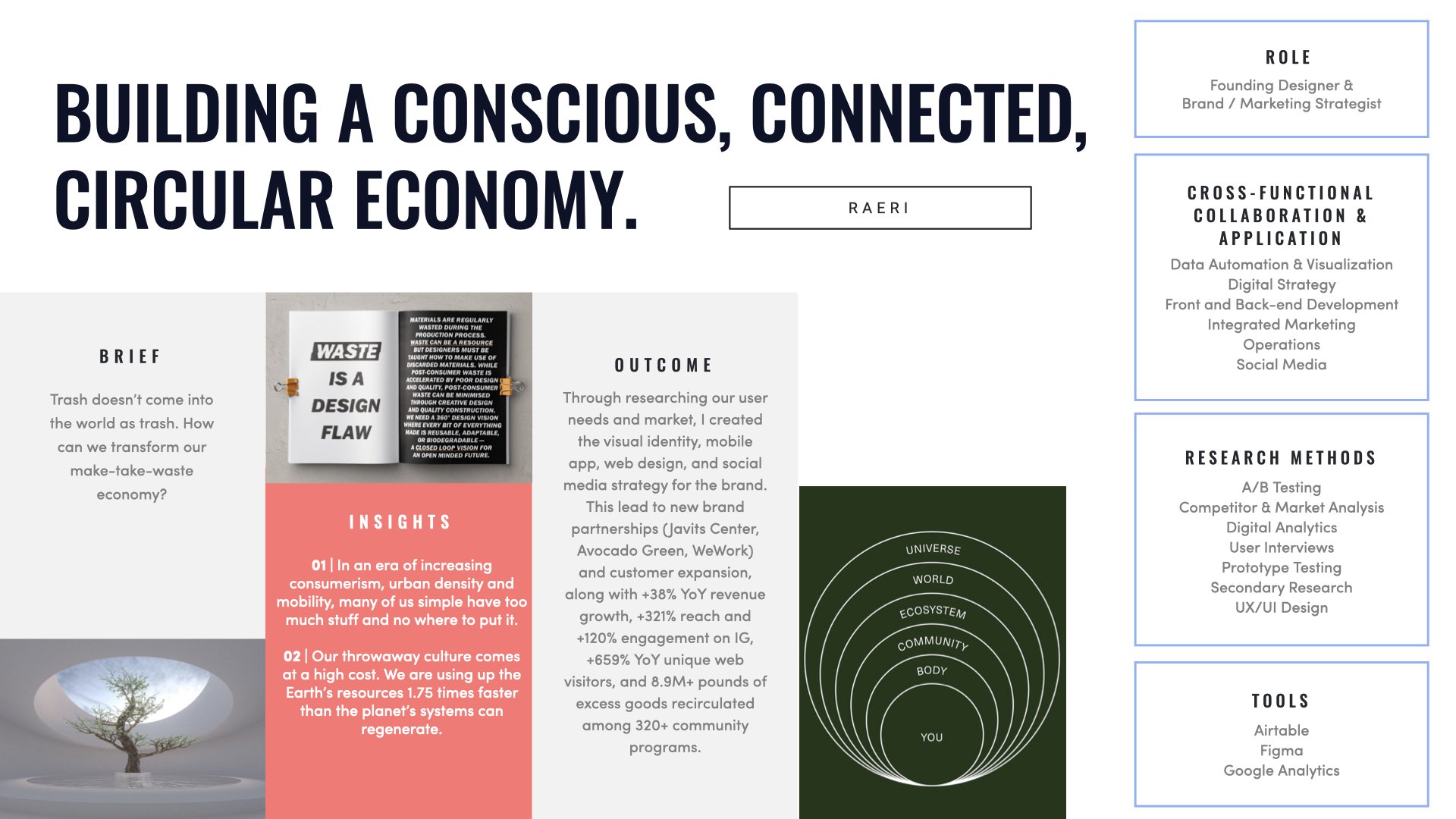
I utilized the KPIs above to access if we’ve accomplished our targets. The outcome — the customer expansion and brand growth from shipping our app allowed us to pursue new brand partnerships (Javits Center, Avocado Green, WeWork) and propelled +321% reach and +120% engagement on Instagram, and +659% yr/yr unique web visitors.
What’s next?
Refining our custom client data automation and impact reporting dashboard.


